Sunday, November 28, 2010

Movements and Styles

 
early modern suprematism: 
I found this piece while browsing images on the internet. The bright colors and strong geometric shapes are characteristic of the Suprematism movement. Suprematism is known to be basic forms and pure color. It is derived from other styles like cubism and futurism. You can see in this piece that both styles of cubism (with the different geometric shapes) and the style of futurism(modern lines and geometric structure) are prevalent.   


American Kitsch: 
I found this picture online. This picture demonstrates the style of American Kitsch in two of it's elements. The woman is wearing a 1950's style dress that has an "a-line" skirt, which reflects the importance of the hourglass figure and womanly curves. The refrigerator also is demonstrative of kitsch because it has curved edges. American Kitsch was all about femininity and curves. These themes were applied anywhere in design from clothing to technology to even cars.


Late Modern: This is an example of Paul Rand's work that is not in the book. I wanted to show an example of late modern design with this picture, because it combines two elements that are consistent during that period. These elements are the contrast between the solid white  graphic egg and the black splatter that looks like  paint. This piece has a symbolic essence while maintaining a visual appeal. This concept is prevalent in late modern design and also in Paul Rand's work.


International Typographic Style: The International Typographic Style emphasizes objectivity, legibility, cleanliness, and use of a grid. This picture is an advertisement for JC Penny I found online. Since Jc Penny went international after WWII they decided to unify all of their visuals to the international typographic style. This design shows the characteristic type face and symmetry found in most designs of this style.


Contemporary: The reason i chose the firefox logo is because it demonstrates "the conceptual image". The conceptual image was something that came to be during the Contemporary period as a means of combining words and image. With the firefox logo, the orange colors represent fire and the fox represents fox, while its encompassing the globe, representing the earth or ability to connect to it(internet). The logo itself is a good example of how the conceptual image was a vital contribution to contemporary design and even to design even today.

Psychedelic: This poster is a good example of Psychedelic design because of the neon color pallet, the art nouveau inspired text and line quality in the female figure, and the text that is pretty much illegible. I found this poster online. I am attracted to it because of it's strong connection to the style of Art Nouveau.


Postmodern: The idea of Postmodern design is that it pushes constrictions, uses experimental typography, and really just ignores all the rules. This was very popular in the 1980's and that is why I chose this piece I found on the internet of a magazine from the 80's. It's expressive type and strong color show the rebellion in postmodernism.


Digital: In the digital revolution, design possibilities are endless. The characteristics of designs from this period are images that look real but are computerized with special programs to make them look that way. In this design, the woman is holding a bird in her hand and she is black and white but the bird is blue...this looks like this could have really happened in real life but we will never know because of the magic of digital imaging.


Rare Prints Gallery Field Trip

In Downtown Franklin, there is a little store that sells old prints that date back hundreds of years. Most of these prints are done by using a complicated process involving metal plates, and sometimes even stones, or wax. Then the print is colored individually by a separate artist. This tedious process makes these prints valuable, but because they are so old, it makes them rare. I really enjoyed my time spent in this store because I love vintage artwork and I was trying to find a print that maybe I could buy. Unfortunately this was the only one I could afford for 25 dollars:
you can barely see the quality because of the glass reflection, but it's a print of some kind of weird squirrel animal. I really wanted a bird or some flowers or something, but of course THIS was the only one that I could possibly get. I decided obviously, not to buy it, because I didn't want an image of an unidentified cat squirrel mongoose on my wall. But it was interesting to study regardless. The amount of detal in these prints is amazing. You can definitely see why they are so pricey, because even though the artist only carves/etches a print once, it takes them a LONG time to do it.

Jim Sherraden from "Hatch Show Print"

In class we had a speaker from Hatch Show Print come in, and talk about the history of the business and what they do. I thought this was one of the best classes because we learned a lot about what the commercial industry likes about genuine prints. It's the fact that they cannot be made on a computer and that they are original. Jim told us that the computer was the best thing to happen to Hatch because of this reason. Most people would think there is no need for such method. But this gives each print an artistic quality that computers cannot give. Big artists like Taylor Swift, Norah Jones, and Imogen heap all have used Hatch to make prints of certain concerts. It was fascinating to hear about such an lucrative outlet for such an obscure and "out-dated" art form.

Printmaking Project

In class we learned about the printmaking process by cutting out our names in a small piece of linoleum. It was sort of a tedious process just to do big letters, so it makes you appreciate how much time and effort are put into making actual prints. This project was fun and unique. I decided to take a more psychedelic approach with my type-style because we had just talked about psychedelic posters reviving art nouveau typography, that day.

Only if this design was permanent!!

So I guess Dr. Pepper decided to change their can to celebrate 125 years of awesome delicious soda!! I ordered a Dr. pepper at Ruson's sushi bar in Nashville, and HAD to take a picture.
This design, is so cool, in my opinion, because it is supposed to look victorian and old fashioned...but it's also very very graphic and also looks modern! I think Dr. Pepper did an amazing job of combining the two approaches. Also, the color palette is so much better than the original can in my opinion. It looks like a brand that's been around forever, and one that you can trust to be consistent in taste and quality. This marketing technique is used by CocaCola. They keep their orginal script typography to let people know that coke is never going to change. That it's still as awesome as it was 30 years ago and will remain a favorite American past-time. Just for decorative purposes I feel Dr. pepper should keep this can design. I think that right now, with most design decisions being made about minimalist ideas, clean/sleek concepts, and designs being robotic looking and technology influenced etc... we are loosing ornamentation and expression in design, which I believe is important! But then again, I'm a fine artist at heart. 

Typography that "says it all"

Aveeno body/skin products have recently become very popular with the whole trend of "going green." My own observation is that people now-a-days are attracted to purity, when it comes to purchasing ANYTHING. People are afraid of diseases, infections, mad cow disease, anthrax, (other scary germs), etc.
But not only are people afraid of impurities in their products, but people are more health conscious about toxic chemicals and brands that say they are beneficial but really are filled with unhealthy and harmful ingredients. This applies to food, beauty products, or anything else that you are trusting to bring into your home. The design on a package is supposed to jump off of the shelf and say, "hey! I'm better than everyone else, buy me" But how how does a designer accomplish this successfully? 
Like I said, we live in a world of skeptical consumers and shoppers. How does a brand not only tell that consumer,"hey I'm better!" but ALSO instill sense of TRUST with that buyer, so that they are convinced that this product is REALLY going to do what it's promising?

From my own observations, I've seen this done in a number of ways. Some designs try and speak to the consumer by using BIG BRIGHT BOLD COLORS AND LOUD TEXT THAT IS BOUND TO STAND OFF THE SHELF. And then there are some designs that take the complete opposite route, and go small, and minimal, and quiet...which ALSO stands out among the other brands.
The brand "Aveeno" does both. And the main design element in all of their package designs, is their logo...which coincidentally is their typography. With a design decision like that, there is a lot of pressure. But the Aveeno typography accomplishes the goal of STANDING OUT and INSTILLING TRUST in a few different ways.
TRUST:
There are serifs on the type, which gives it an old fashioned look. This feeling of back-to-basics is extactly what the brand wants you to feel. But the serifs are curved, which is soft, and kind, and pretty much basically say, "hey, you don't have to buy this product but we'd like you to because we care and we're honest"
ATTENTION GRABBER:
The choice of black, is obviously going to stand out on the light colored background most of the products have. And the decision to make it bold is also effective in making it stand out. The type style is modern enough that is legible, and communicates fast. It is also very simple and standard/geometric in that the two e's create a linear feel to the design. 

A More Modern Mello Yello

Have you seen the new package design for mello yello? It's hard to identify this soda as the one we used to drink by the gallons back in the 1990's. With this new design, Mello Yello has re-invented itself as almost a whole new product. The design, in my opinion, is pretty cliche when you think about how many corporations are re-branding themselves these days. Most major brands are moving towards clean, sleek, minimalistic approaches when designing their visuals. I originally saw the new package design on a billboard when driving one day and it caught my attention. I was like wait, is this MELLO YELLO???


even this one is "new" because I remember the old, old design with the big chunky letters that were hard to read. Regardeless, it's easy to see where major brands are taking their designs: minimal, sleek, clean, and modern.

Target "Tricks"

Everyone knows that shopping at Target is not necessarily a glamourous experience. As for me, I know I've showed up to that store in my pajamas to buy paper towels and maybe some shampoo. But in the new Target advertisement campaign, their whole angle is to "trick" you into believing that it is some sort of high-end retail store. They want you to feel like a rockstar in their clothes, like a model when using their kitchen appliances, and all for a discounted price?
Just look at this. I'm not saying it's poorly done. I actually really like this whole concept. It's very modern and chic, but also effective because they stick with using the target symbol and the eye-catching RED in every design. Their ads are consistent which is important.

These advertisements, in my opinion almost reflect a 1050's American Kitsch style in some of them, because of the use of beautiful glamorous women, and the wholesome family, home-maker themes.
They also are very modern and almost european, which is also effective in getting consumers to feel like they are getting well made, luxury items at Target.
This campaign attracted me because I love when companies use old techniques and make them apply to today's world. These marketing approaches have been used for decades, and I give props to target for reviving them!


skechers needs to "shape-up" their campaign!!

This is definitely one of the worst magazine advertisements I have seen in a long time. It reminds me of an advertisement you would see back in the 1950's when they didn't understand that the image could say just as much as the text. There is clarly, too much text in this design. The reader doesn't know what to look at first! do you look at the  different kinds of shoes they offer? do you look at the model? are you supposed to read the diagram? First of all, in my opinion there shouldn't be a DIAGRAM in an advertisement! YOu should be able to see the product and understand what it does before you have to play connect the dots. To me this ad is poorly designed when it coms to color, layout, content, type, and overall composition. 

Sunday, October 10, 2010

Photograms


These are my two photograms. Yes, they kind of suck. The first one, unfortunately was the best one, and all of the objects I placed on the sun-sensitive paper came out as large blurs. I did this project at home because I was absent the day we did it in class. I went out to Hobby Lobby and purchased the sunlight paper kit that shows you how to make these pictures. I then followed the directions by placing some objects on the paper(i used pieces of jewelry) and then covering them with the plastic thing and letting it sit in the sun for 5 minutes. I then rinsed off the paper with water and waited.....but only to find a blurry mess. I did this three separate times and had the same result. I'm not exactly sure what I did wrong, but I gave it my best shot!! :(

Art Deco

my work
A.M. Cassandre's poster for Dubonnet reflects the modern style of art deco. The figure of the man drinking from a glass is executed using geometric shapes and flat colors. The text is also very geometric and futuristic looking, which is a common quality in pieces from this period. In my re-creation of this work, I also used bold and geometric lines to show that Art Deco was about precision and machine-like design.

Cubism

My work
This is Picasso's "Nude". You can see the introduction of cubism in Picasso's work, by keeping the curves of a woman's figure, but using many geometric shapes to do so. This interpretation of a woman's body was unique and revolutionary for the time period. It combined the soft contour of a woman and harsh geometric lines into the same picture plane.

Art Nouveau

I chose Alphonse Mucha's poster for Job cigarettes as an example of art nouveau because of a few reasons. His stylized lines, reflecting plant like designs, are a common trait of graphic design from this period. Also, the fact that the entire poster is filled with decorations and ornamental elements, reflect the common appeal to decoration and detailed design.

My work is demonstrative of Mucha's because of the plant like strands of hair, decorative border, and lots of detail.

Arts&Crafts

I chose Arthur H. Mackmurdo's design element from "the hobby horse" to show that for the time period, creating white lines on a black background and the use of negative space, was unique. His stylized forms and plant like lines, foreshadow the movement of Art Nouveau. We continue to use this concept of negative space to create impact in other designs today.
my work

Victorian

My work
I chose Charles Dana Gibson's poster for Scribners to display the Victorian Movement. This poster shows that the designer captured the victorian woman but did not think about the design as a whole. The typography does not go with the image and shows that Gibson was not thinking about image and type together.

Papermaking

In class, we learned how to make paper out of bits of old newspaper, fabric, and other scraps. The process was really interesting because when you think of paper, you don't think of how much we use or produce. Maybe we would use less and recycle more if we were making paper like this. But unfortunately this process is only a craft, or something people do for artistic purposes....it just takes too long to mass produce. I wrote "Time heals all wounds" because the day we made paper, was about a week after my grandmother passed away...and it was the day I went to visit her at her burial site. I remember papermaking day for more reasons than one.

Monday, October 4, 2010

big. sexy. hair. period.

The package design for big sexy hair products screams SUCCESS to me, for a number of reasons. First off-RED packaging is a bold move. Feminine enough, but loud enough that it will stick out on the shelf.  Next reason- the typography takes up the entire surface of the product. You look at a shelf, full of endless hair products that claim (in small font that you need to hold the product close to your face to read) they will make your hair look like the hair of celebrities...thick, long, strong, shiny, etc...
You glance over all the products, thinking to yourself, "this is too overwhelming..so many choices."
When what do you see? RED CAN. HUGE FONT....BIG. SEXY. HAIR. PERIOD.
no if's and's or but's.....
This is the product that is called big sexy hair because that's exactly what it will give you. There's nothing fancy and confusing  about the name-like herbal essences...or garnier fructis...(products that claim to plump your hair up, make it straight, curly, shiny, sleek, short, and long ....all while making your scalp smell like fruit salad) This is the product of POWER.
It makes a statement on the shelf, and so you think it might do the same for your hair.
As a designer, that's what I call effective design. period.

Monday, September 27, 2010

SIMPLICITY.


This is a graphic designer, originally from Bulgaria. Judging by the name, I'm not quite sure if this person is male or female but in reading their about me, I know that they must be fairly young. What I love about Mihail Mihaylov's  designs is that they are very simple, well rendered, and modern, but are LOUD.  They speak clearly. They convey exactly the message you are supposed to be getting from the design without cluttering your brain or causing you to be confused. This person's particular design, I guess for some book store, reminds me of the universal symbol for male and female restroom. The thick line quality and two color design, tell you exactly what the subject is, but in a way that is appealing to the eye...and is also memorable.

Thursday, September 16, 2010

Yeoman's In the Fork FIELDTRIIIIIIPPPPPP!!!

Yeoman's In the Fork is a bookstore unlike any other. For it has books that date back  decades to hundreds of years ago. I enjoyed the tour of the store as well as observing the merchandise on my own, as I realized a few different things. First off, books are special. Yep, it's not just text. It's a craft and it's a design. People collect them, give them, keep them, show them off, and even auction them for thousands of dollars. Why? Because up until recently, there was more to value about a book than what was inside. Book collectors look for intricate binding, rare materials, papers, and originality in the cover. Also, people who like history love having old books because some are like windows to the past that you can hold in your hand. Apparently there is something magical about reading a book that John Hancock read himself. Holding documentation signed by a famous historical figure, gives people a sense of personal connection to the impact that particular person had on the world. And in turn, makes a person feel like they have experienced that impact, in someway themselves. Many people collect old books because they like to have treasure. I would call the men who run the store, "treasure hunters" because thats exactly what they do....they hunt around the nation looking for printed value.


 One of the books I found to be interesting, but was not worth a lot of money, was the Daniel Boon book. It's vintage quality on the cover and interesting material used for it's binding was fun to look at. I loved the designs on the front because you don't see much like that anymore. I guess that's why people collect books n the first place, because they are antiques, and hard to find these days.

Saturday, August 28, 2010

The reason why Benefit Cosmetics, BENEFIT$$$


Benefit Cosmetics. I have been purchasing their products since I was 12. Yes, I started wearing makeup at a young age. What little girl doesn't like putting on her mother's lipstick and mascara and pretending she's all grown up? But when I entered a stage of my life (middle school) it wasn't pretend anymore. Looking older, feeling older, becoming a woman, that was important. And I was drawn to make up as my main utility for that.
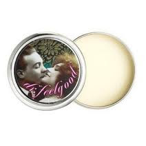
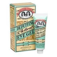
Benefit cosmetics market their products to females of every age. The uniquely designed packaging catches a shopper's eye when walking through a department filled with boring, cliche solid colors and typical product names. Everyone knows that the color on your lips is lipstick. Everyone knows that the black stuff on your lashes is mascara. But Benefit takes these conventional makeup necessities and embellishes them- creating a brand new product out of things women have been using for generations. Benefit does this in a number of ways. Most importantly, it's the visual appeal. Ultra feminine, ultra vintage, mostly pink, cursive, swirly twirly, pin-up girl......this is what gets me to look at the product. They bring that retro, "embrace your femininity" make-up is for every girl, mentality into the typography, color pallets, and content on the package. For instance: who wants to buy foundation primer in a glass bottle when you can buy "That Gal"?  I want to be that gal! who is she?! I guess I'll find out after I purchase this product!  Who wants to buy lipgloss when they can buy THE gloss?  Is it better than other glosses?

Every product from benefit is in it's own category. It's something unique to benefit. You can't purchase it from any other line, and you won't see anything like it anywhere else.
(this would be equivalent to your typical bronzing self tanner/ highlighter/ body shimmer)

The other important reason I believe Benefit Cosmetics is Successful, is because owning their products turns your makeup bag into a fashion statement. And a sign of good taste. When another woman sees you putting on a Benefit product, They will most likely comment on the design, and then ask you what it is. Their designs are classy, not trashy....unlike many brands who try and create "fun" packaging with makeup. Usually only teenage girls will buy the product and it makes the brand look immature, and therefore less effective or worth your money. (lip smackers, bonnie bell, wet & wild, etc) The products of benefit all have a similar feel, and that is, CLASSIC & FEMININE. What makeup - wearing woman wouldn't be attracted?

 I think there is a Barbie lover,  an easy bake oven girl,  a have dinner ready-by-sixer, an apron wearer, and a homemaker by day/ sex kitten by night.....in all women. Benefit cosmetic's successful sales  just might prove that, time and time again.


Sunday, August 22, 2010

100 posters 134 squirrels


The art of graphic designer, Jay Ryan has a book called 100 posters 134 squirrels. I own this book, along with many other graphic design books...but this one particularly stands out to me amongst the others. It is filled with his works as a screen printer/poster artist. His posters, in my opinion, are wonderful. I love the way he combines fine art and drawing with his ability to design graphics. I don't think many people can do that successfully. A lot of artists attempt to create elaborate posters showing off their abilities to draw cartoons and how trendy their design can be, while ignoring their main purpose of that design in the process. Jay Ryan has a specific style. He likes to draw cute and funky creatures ( a lot of squirrels, go figure) and use muted pastel colors. I think that's pretty brave for a graphic designer because most of us think that BOLD and BRIGHT and SOLID colors grab attention, while Jay uses soft blues, pinks, yellows and grays to seduce his viewers.  His drawings, like I said, all have this cute, sort of hand drawn appeal, and that is what makes him unique as a designer. Most
designers concentrate on sharp lines and very simple expression that people don't necessarily have to react to emotionally. But when you look at his work, you may laugh, say, "awwww" or think it's totally weird and bizarre. I believe that's what makes a good artist- the ability to make your audience FEEL, REACT, or THINK.

He also maintains a cleanliness in his drawings/desings that aren't too over powering or cluttered which is a common mistake we see as consumers. How many times have you seen a magazine ad when flipping through and didn't even really take the time to look at it because, well, there is just TOO MUCH to look at?!!??? Jay Ryan designs his posters so that they are easy on the eyes and intrigueing at the same time. His line quality, unique content, and color pallet tell us that whatever he is promoting is trendy, artistic and INVITING. I personally think, as a designer and as a consumer, it's important to not feel overwhelmed when trying to be sold something. His simple, but powerful fine art skills in his desings make you want to look at them. And when creating promotional material, that is the ultimate goal.
Go to this website to check out more of his work! It's all pretty cool.
http://www.thebirdmachine.com/gallery.php?year=2010