
Benefit Cosmetics. I have been purchasing their products since I was 12. Yes, I started wearing makeup at a young age. What little girl doesn't like putting on her mother's lipstick and mascara and pretending she's all grown up? But when I entered a stage of my life (middle school) it wasn't pretend anymore. Looking older, feeling older, becoming a woman, that was important. And I was drawn to make up as my main utility for that.

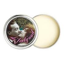
 Benefit cosmetics market their products to females of every age. The uniquely designed packaging catches a shopper's eye when walking through a department filled with boring, cliche solid colors and typical product names. Everyone knows that the color on your lips is lipstick. Everyone knows that the black stuff on your lashes is mascara. But Benefit takes these conventional makeup necessities and embellishes them- creating a brand new product out of things women have been using for generations. Benefit does this in a number of ways. Most importantly, it's the visual appeal. Ultra feminine, ultra vintage, mostly pink, cursive, swirly twirly, pin-up girl......this is what gets me to look at the product. They bring that retro, "embrace your femininity" make-up is for every girl, mentality into the typography, color pallets, and content on the package. For instance: who wants to buy foundation primer in a glass bottle when you can buy "That Gal"? I want to be that gal! who is she?! I guess I'll find out after I purchase this product! Who wants to buy lipgloss when they can buy THE gloss? Is it better than other glosses?
Every product from benefit is in it's own category. It's something unique to benefit. You can't purchase it from any other line, and you won't see anything like it anywhere else.

(this would be equivalent to your typical bronzing self tanner/ highlighter/ body shimmer)
 The other important reason I believe Benefit Cosmetics is Successful, is because owning their products turns your makeup bag into a fashion statement. And a sign of good taste. When another woman sees you putting on a Benefit product, They will most likely comment on the design, and then ask you what it is. Their designs are classy, not trashy....unlike many brands who try and create "fun" packaging with makeup. Usually only teenage girls will buy the product and it makes the brand look immature, and therefore less effective or worth your money. (lip smackers, bonnie bell, wet & wild, etc) The products of benefit all have a similar feel, and that is, CLASSIC & FEMININE. What makeup - wearing woman wouldn't be attracted?
I think there is a Barbie lover, an easy bake oven girl, a have dinner ready-by-sixer, an apron wearer, and a homemaker by day/ sex kitten by night.....in all women. Benefit cosmetic's successful sales just might prove that, time and time again.


